A guest post on Geek Wire today caught my eye with its contention that the tweets that would come from the grand opening of the new Gates Foundation public visitor center would likely "reveal [a] passive, insular global health community." The argument was based in part on the visualizations done by sociologist Marc Smith. Curious if Smith's visualizations about the Gates Foundation would uncover anything interesting about the education community (are we "passive" and "insular"?!), I had a look at some of his work on Flickr.
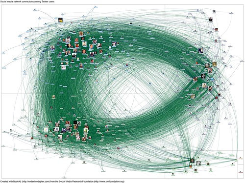
And what did I find? A wonderful visualization of the social network graph of Educon -- or at least a visualization of the connections between Twitter users who tweeted the word "educon" over the course of last weekend.
The green lines are "follows" and the blue lines are "reply" or "mentions."
I love the visualization, as I think it reveals relationships, connections and -- far better than I could explain -- the sense of swirling and fast-paced conversations that occured both online and offline over the course of the three-day event.
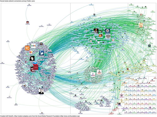
Below is a visualization of the social network graph of the Gates Foundation -- or rather the connections between Twitter users who tweeted the word "gatesfoundation" between January 29 and 31. Again, green lines represent "follow" relationships, and blue lines are "reply" or "mentions."
Granted, these aren't necessarily education-related tweets -- but still, it's a very different looking network having very different looking "conversations."
While the Geek Wire article cited above is addressing a disconnected global health community, this passage seems noteworthy to think about in other areas in which the non-profit is active: "What the network shows is that Gates serves as a broadcaster (see the star network on the left side around Gates Twitter account), but does not help to encourage the community to actively connect with each other. Ties are not reciprocated and there are very little interactions among the overall community."
Clearly the community around Educon thrives on reciprocity. You can see it in how we tweet. But is it an insular community? Are these conversations being heard outside that circle?
For a better view of the graphs, be sure to click through to Flickr and look at the full size images. You'll also find more information there about NodeXL, the tool used to create the layout, as well as the Clauset-Newman-Moore algorithm used to calculate these different clusters.

